
 In the past year or so, the blogosphere has been full of claims concerning short-term global temperature trends and their supposed falsification of the scientific consensus on anthropogenic global warming as set forth in the IPCC Fourth Assesment Report (AR4). In this post, I’ll present a comparison of the AR4 near-term projection to smoothed observed trends. This comparison shows the recent observed trend to be somewhat below the projection, but still well within a reasonable confidence interval.
The above mentioned contrarian claims include, of course, the oft-repeated canard that global warming has “stopped” (or slowed significantly) since 1998, or that IPCC projections are based on climate models that are “failing abjectly”, as the Cato Institute (Pat Michaels) put it.
The various claims have been rebutted effectively: see, for example, this recent post at Real Climate demolishing Monckton’s latest travesty, or the latest discussion of short term temperature “trends” and other curve-fitting follies at Open Mind.
In general, the contrarians tend to gloss over or underestimate the uncertainties in the short-term model projections and/or corrresponding observations. Short-term linear trends tend to fluctuate wildly about the more stable longer-term trend, sometimes well above the projected trend and sometimes well below. For example, the eight-year trend in the GISTemp global temerature record (from NASA) was relatively flat from 2001-2008, but stood at 0.35 deg/decade two years earlier.

Meanwhile, the longer term trends are relatively stable, and indeed are mostly higher in the 2000s. Indeed, in all the main global surface temperature data sets both the 20-year trend and trend from 1979 forward was higher at the end of 2008 than at the beginning of the decade.

But having waded through the back and forth volleys of spaghetti graphs of detailed monthly model ensembles and observations, I’m convinced that a straightforward comparison of smoothed projections and observations would bring a different perspective and, perhaps, some welcome clarity.
Such a comparison is found for the 2001 IPCC TAR (Third Assessment Report) projections in a 2007 Science “brief” by Rahmstorf et al. (PDF available here).
The following graph is an enhanced version of the key figure and can be found in Tamino’s post on this subject. The IPCC projections were based on climate model run ensembles for various emission scenarios from 1990 forward. The figure shows observations up to 2007 for NASA GISTemp (red) and HADCrut (blue) were mainly in the upper range of projections (dotted lines and shaded area).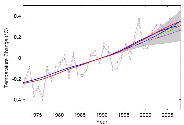
In order to undertake a similar analysis comparing current observations to the latest IPCC projection, we first derive a smoothed temperature record to the end of 2008, using a 21-point lowess smooth (data used goes back to 1970 and is baselined to 1980-1999).

Both temperature records rise fairly smoothly over the last three decades, with GISS slightly above HADCrut for the 2000s.
As in TAR, the latest IPCC projections found in AR4 (Fourth Assessment Report) were based on climate model ensembles, run for a set of standard emission scenarios, only this time from 2000 forward. The projections were derived by extracting key graphs in Chapter 10 of the WG1 (Working Group 1) report. First we give the detailed projections based on multi-model means for the A1B and A2 scenarios, as extracted from Figure 10.5 from AR4 Chapter 10 (with the use of a bitmap extraction tool.

In the current decade, the two scenarios are quite close, with a slight increasing divergence as we approach 2030. Here’s a closer look at 2000-2010:

As one would expect, the observed annual values show considerable interannual variation. But even the model means show some variation, pointing up one of the advantages of the smoothing approach. The 2001-2008 trend for the A1B is 0.24 deg/decade, while the 2000-2010 linear trend is 0.21 deg/decade, an artifact of the random variation within the model ensemble. So the 2001-8 period for that scenario yields an exaggerated expected trend. (It just so happens that 2008 is the warmest year in the first decade of the A1B model mean annual series, and 2001 the coolest).
In the first decade of the projection period there is minimal divergenge (A1B is just over 0.2 deg/decade and A2 is just below 0.19 deg/decade). So we will use the illustrated 0.2 deg/decade as our smoothed trend.
Finally, we have used AR4 Figure 10.26 to impute confidence intervals for the smoothed trend. That figure gives a standard deviation of about 0.06 deg deg C in 2000, rising to 0.12 deg C (A2) or 0.13 deg C (A1B) by 2010 for the A1B scenario. (This zoomed PDF graph of the A1B smoothed projection to 2020 shows an example of the PDF markup used to estimate these values).
Using a z-score of 1.63 (corresponding to a 90% confidence interval) yields limit trends of 0.1 deg/decade up to 0.3 deg/decade. This interval may be slightly underestimated (since it does not take into account the small divergence between the various scenarios), but seems a reasonable approximation.
Putting all the elements together gives the figure at the top of the post:

So for 2000-2008, the IPCC smoothed projection was an average of 0.33 deg +/- 0.13 deg (90% confidence interval) above the 1980-99 baseline. Both NASA GISS (0.26 deg) and HADCrut (o.25 deg) were within that range, albeit in the lower part.
Some observations:
- We are only 9 years into the 31-year early 21st century projection period (2000-2030), so it’s far too early to draw any definite conclusions concerning the attribution of model-observation discrepancies.
- There continues to be a growing divergence between GISS and HADCrut data sets (undoubtedly due in large part to the inclusion of the Arctic region temperature estimates in GISS).
- TAR and AR4 both projected similar trends in the 2000-10 period. Yet observations were well above the TAR projection, while observations (extended only two more years to 2008) are below the AR4 trend. This is due in large part to the change in baseline methodology for matching model projections to the past.
Indeed, smoothing of the observations shows the import of this last point. As shown above, the smoothed observation trends are already about 0.05 deg C below the IPCC trend line at the beginning of the projection period (and never “catches up”). And as seen below, the projected trend sits well above the smoothed observations even back to 1990.

This suggests that a different baselining methodology might show a better match between the smoothed projection and observations. But that is a discussion for another time.
[Update: A few references on lowess smoothing are listed here:
http://en.wikipedia.org/wiki/Local_regression
http://www.itl.nist.gov/div898/handbook/pmd/section1/pmd144.htm
https://stat.ethz.ch/pipermail/bioconductor/2003-September/002337.html
Worked out example:
http://www.itl.nist.gov/div898/handbook/pmd/section1/dep/dep144.htm ]

Hiya Deep
I was thinking about all this and think there is a really fundamental flaw in calculating ‘decadal trends’ over very short time periods. They will often given very stupid results.
I was looking at some of Lucia’s plots and her ‘analysis’ and realised that her analysis could give a negative trend for each decade, despite the longer term trend being positive. If your data set forms a ‘saw tooth’ her analysis will give a very poor result.
For example, if the data for a three decade period looked something like the following list, her analysis will probably still give a negative decadal trend even though over the thirty years it’s positive.
81 0.13
82 0.15
83 0.11
84 0.10
85 0.08
86 0.06
87 0.06
88 0.05
89 0.07
90 0.08
91 0.09
92 0.12
93 0.15
94 0.14
95 0.12
96 0.13
97 0.14
98 0.13
99 0.12
00 0.11
01 0.16
02 0.22
03 0.25
04 0.29
05 0.27
06 0.25
07 0.26
08 0.25
09 0.24
10 0.23
Her results are poor because she only considers the decadal trend to be something constrained within a particular decade.
Actually the last ten year period looks like a bad example, maybe correct the early years (01 and 02) to make them warmer and you get my drift.
People should take a look more often at the past temperature record. No need for sofisticated statistical tools, just eye inspection is good enough to not be bothered by a lower rate of warming for a few years.
Anyway, thanks DeepClimate for doing the dirty job 😀
“This suggests that a different baselining methodology might show a better match between the smoothed projection and observations. But that is a discussion for another time.”
Why do you need a better fit between an observational series with a model derived smoothed series? Is that not saying that the model is correct and the “real world” must be made to comply with it?
[DC: Discrepancies between projections and observations could be a result of model error or natural variations (or some combination thereof). The IPCC AR4 methodology (unlike TAR) baselined projections to the 20th century “hindcast”, using the average from 1980-99. The model error can therefore be conceived as having two parts, namely in the “hindcast” baseline and in the projected trend. Baselining the projections to smoothed observations up to just before the projection period would permit focusing purely on the projected trend. This is the approach of Rahmstorf et al cited above.
This is not meant to suggest a new interpretation of the IPCC AR4 projections, which are unequivocally based on the 1980-99 model mean baseline. It is also worth noting that for the medium-term projections to 2030 contemplated in IPCC AR4 (to 2030), a different baselining would only affect the projected rise by at most 10%. Finally I note that this alternative baselining would in fact fit the model to the “real world” and not the other way around as you suggested.
You say:
“In order to undertake a similar analysis comparing current observations to the latest IPCC projection, we first derive a smoothed temperature record to the end of 2008, using a 21-point lowess smooth (data used goes back to 1970 and is baselined to 1980-1999).”
Your graph says LOESS which is a different algorithm. That being said, using a 21 point loess (span = 0.7? in R) is far too coarse and is not the intended purpose of that statistical method. Loess and Lowess were designed as noise reduction algorithms and adapted to statistical method for other noisy data types. A span of 0.7 in almost any series is next to useless for the derivation of signal from noise. For your dataset a span of 0.25 or 0.3 would be far more suitable for fitting to the data. The span should not reflect the length of the base period but the minimum length of the span that will give an accurate signal from the noise.
My point is that you are using lowess or loess outside of it’s intended purpose and with a smoothing factor that most statisticians (I referred this before to a statistics expert) would regard as not giving any useful information.
[DC: Some authorities treat lowess and loess as equivalent, while others treat lowess as a particular form (namely local linear fitting) of the more general loess smoothing (which can be quadratic). I’ve added a few references on the subject as an update above. I’ll also relabel the graph to eliminate any confusion.
Recommended alpha for lowess smoothing (i.e. ratio of smoothing “window” to number of data points) is 0.25 to 0.5. In the case of global surface temperature series, it is very common to analyze series since 1900 or 1950. Applying the above rule of thumb to such series would give anywhere from a 21-point to a 55-point window.
21 points makes intuitive sense, because this uses a decade before and after each point of estimation. It also happens to be the same number of points used by HadCRU’s binomial weighted moving average (which can be seen, by the way, as a special case of loess smoothing, with polynomial degree = 0 and an alternative weighting function).
Of course, lowess smoothing is much superior to the higher-order polynomial trends used until recently by Roy Spencer, as discussed in a previous post.
What do you mean by ‘longer term trends are relatively stable’? It is obvious that the longer your trend period is, the more slowly it will change. No matter how you try to spin and manipulate the data, the trend is falling, contrary to the predictions of the scaremongers who claim it is accelerating.
The other thing that you fail to mention is that the fall in the 8 year trend in the early 1990s was due to the Pinatubo eruption in 1991. There is no analogous eruption to explain the current falling trend.
One can plausibly argue that observed temperature trends are below projections, albeit without statistical significance. But there is absolutely no evidence that “trends are falling” in any meaningful sense (i.e. at the multi-decadal level).
The recent inter-annual trough appears to have resulted from the confluence of a fairly strong with La Nina episode with an unusually extended inter-cycle solar minimum (both of which have now ended). It is almost certain that the eight year trend from 2003-2010 will be well above that from 2001-2008. At that point will you then say the “currently falling” trends are rising again?
Here’s a comment from Lucia (originally posted at the Blackboard):
Answer to above comment from Lucia:
A) 2008 outside confidence limits.
These are 90% confidence limits derived from the smoothed projections in AR4 Fig. 10.26 (as explained above). The smoothed observation trends are within these projections. Some individual years are outside smoothed projected/hindcast trend confidence limits (e.g. 1998 and 2008), but that is to be expected.
B) Linear trends 2000-2010
For the period shown in my final graph, I have A1B at 0.207 deg/decade and A2 at 0.176 deg/decade. The average between the two is very close to 0.19 deg/decade, so the generic 0.2 deg/decade is a tad high, if anything.
C) Smoothed projection trend
The smoothed projections in fig. 10.26 are very close to linear for the 2000-2010. I could have shown the actual smoothed trends for A1B and A2, and perhaps I will in part 2. This will slightly complicate the graph, but not change the essential conclusion.
Pingback: “Suppressed” Carlin report based on Pat Michaels attack on EPA « Deep Climate
1. I corresponded with a “biggie” in the error determination field (Lucia would respect the guy). He doesn’t want to get into blog storms. But thinks that Lucia is not properly accounting for long temr variability when looking at her several year trends. Finds your graph of multi-year trends compelling and had some other reasons for Lucia being off. (Basically not properly accounting for the longer term noise.)
2. Change topic: Could you do a second degree polynomial fit to the full series UAH data? or RSS? I just want to see how much the “recent flattening” turns the record with that degree of play (not saying its justified, but just to look at).
3. How do I download the monthly data to Excel so I can do regressions?
[DC:
1. If your “biggie” correspondent likes me, he’ll love Tamino. There was a recent post there (within the last month or so) on the correct calculation of short-term uncertainties. I’ll try and dig that out when I have a chance.
2. As I’m sure you know, there are only two possibilities for the slope change. I believe it will be decreasing, and the polynomial fit will show some “flattening”. On the other hand, the linear fit for 1979-2008 is higher than 1979-2000, so who knows for sure. I don’t think it means too much either way, but I’ll try it when I have a chance and give you a link.
3. Short answer – check the data links at Tamino’s. He really does have it together. Let me know if that works.
Later .. gotta run]
I think the biggie actually knows more about his particular part of things than either of you, but that Tamino would have more skills in his area. However, you guys know a lot more of the details of current climate debates and such. I think he’s just kind of one of these people’s who pretty bemused and not really a part of the debate. His reaction to seeing your picture of the trends was…yeah…that’s what you’re going to get in that situation. Because to start with, he thinks any 10 year temp trend is going to have too much uncertainty because of autocorr.
Thanks.
[DC: I just meant I’m not in the same league as Tamino. But I think we can all agree on 10 yr temp trends.]
IPCC projections disproved!
[DC: Off topic – also your linked chart connects a smoothed curve up to 2005 to actual observations for 2006-2008. That’s highly misleading.]
Girma, go to Tamino’s page. Look at the latest post. Then look at the graphs in which Tamino compares model output (for those AOGCMs used in AR4) with the observations. The models are pretty good.
Anyhow, I do not want to debate this with you here b/c it is OT. Go to Tamino’s blog a pontificate there.
[DC: I think Girma has been banned most places, for obvious reasons.]
Pingback: Michaels and Knappenberger’s World Climate Report: “No warming whatsoever over the past decade” « Deep Climate