
[Updated May8] This post seems to have caused some controversy and even derision in some quarters (especially Lucia’s blackboard). Some of that was even justified. That’s what I get for posting overly quickly (a mistake I won’t make again).
The essential point, though, is that short-term trend analysis is of dubious value when comparing global temperature observations to IPCC projections, because such trends fluctuate so much. Comparisons of the analysis period to the baseline, whether using average anomaly, linear trend or smoothed trend, is likely to be more indicative of the true situation.
Having said that, I acknowledge that this post was not a particularly good effort on my part. I hope to rectify this very soon by presenting a detailed analysis of the IPCC AR4 2000-2010 projections, including the fit of smoothed observations to the AR4 early century projection of 0.2 deg C/decade, with appropriate confidence intervals. In the mean time, I have updated the graphs below to include only averages of five years or more, as well as displaying the correct AR4 projection relative to 80-99 baseline. [end Update]
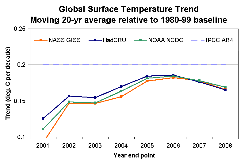
 Today, I continue my exploration of recent global surface temperature Tobservations, and their consistency with IPCC AR4 projections. I’ll present a metric that compares observations up to the end 2008 with the IPCC baseline (1980-99). The computed trends to the end of 2008 are:
- NASA GISS: 0.18 C/decade
- HadCRU: 0.17 C/decade
- NOAA NCDC: 0.18 C/decade
The idea is simple enough. The IPCC Fourth Assesment Report (AR4) stated: “For the next two decades a warming of about 0.2°C per decade is projected for a range of SRES emissions scenarios.” (Synthesis Report Summary for Policymakers). The scenario projections refer to baseline of 1980-99, with overall rises to 2011-2030 for the various scenarios presented (the details of which are in Chapter 10 of the WG1 report).
In effect, then, the IPCC is projecting the 20-year average to rise at a rate of about 0.2 C per decade. This suggests a metric based on average temperature, relative to the baseline average. My first (naive) implementation of such a metric simply computes the moving 20-year average over the post-baseline period, and establishes a trend metric by dividing the difference in average anomaly of the two periods by the elapsed time. The following graph shows the result of the “naive” approach.

All three data sets show a trend of close to 0.17 deg C per decade. However, until enough data has accumulated, the moving average contains a large amount of the baseline period and could be affected by trends within the baseline.
It would be better, then, to limit this comparison metric to the period beyond the baseline, that is starting in 2000. This complicates the calculation of the elapsed time slightly, as it is based on a comparison of periods of unequal length (and will continue to be until 2019). In the case of the period 2000-2008, the elapsed time for the purpose of trend calculation is 14.5 years (the difference between the exact centre of each period).
This gives the result previously noted, which is slightly above the naive moving average calculation, as seen in the following graph.
As one might expect, this metric is much less sensitive to changes in the particular start year than a short term analysis confined to the post-baseline period. (I would also argue that it’s much more meaningful as well). Changing the comparison period to 2001-8 (i.e. eliminating 2000) does result in higher computed trends earlier in the decade, but by the end of 2008 increasing convergence is observed as expected.

For the shorter 2001-2008 period, the trend to 2008 is only slightly higher, by about 0.01 deg C in each case.
Once again, the overall conclusion is the same: recent trends are below, but still consistent with, IPCC projections.

Pingback: 20-year surface trends close to models « Deep Climate
I don’t understand how you are calculating these trends. My best guess is that they are the slope of a line drawn between A and B:
A being the average temperature from 1980 to 1999, plotted against the year 1990, and B being the temperature in year X.
However this gives me 0.11 degrees per decade for GISS for 2008, which is much lower than what you show, so the calculation must be something different?
[Yes, I agree that I should have made the calculation method clearer. Each trend is the difference between two averages (not a single point). So to take the GISS 2008 example, I take the difference in average between 2000-8 and 1980-99 baseline, and divide by the elapsed time centre-to-centre. The centre of the projection period is 2004 and that of the baseline 1989.5, for an effective elapsed time of 14.5 years. In this case, the difference is 0.26 deg/1.45 decade = 0.18 deg. decade.]
Deep Climate, where is your RSS feed?
Ran across you (again) via your comments to Yulsman’s post – you are right on.
e.g.
http://www.cejournal.net/?p=1337#comment-1686